Real Estate App Design Case Study: Homely

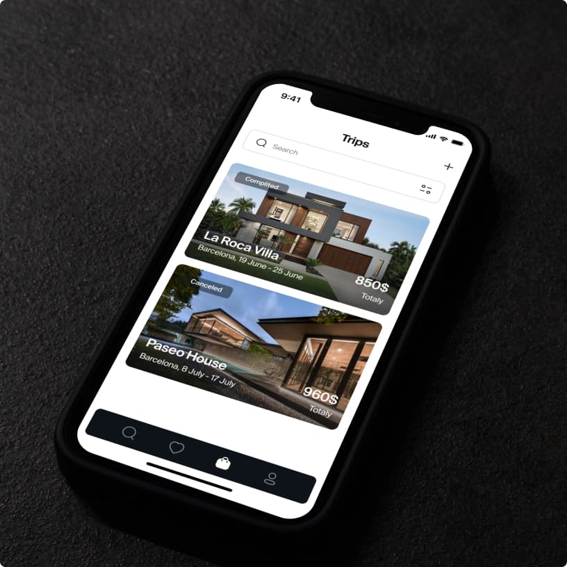
Booking a luxury vacation shouldn’t feel like hard work. That was the simple idea behind Homely, a real estate app design we built to fix the premium travel experience. This real estate app design case study details how we created a curated, user-centric platform that replaces hours of stressful research with a few minutes of enjoyable discovery.

UX/UI Design
Proptech
Travel Tech
Research
Real Estate App Design Case Study: Homely

The problem Homely set out to solve wasn’t a lack of properties, but a lack of trust and curation. For travelers seeking a high-end experience, the search process itself rarely feels premium. It’s a time-consuming trawl through crowded marketplaces, trying to tell the difference between true quality and a good photographer.

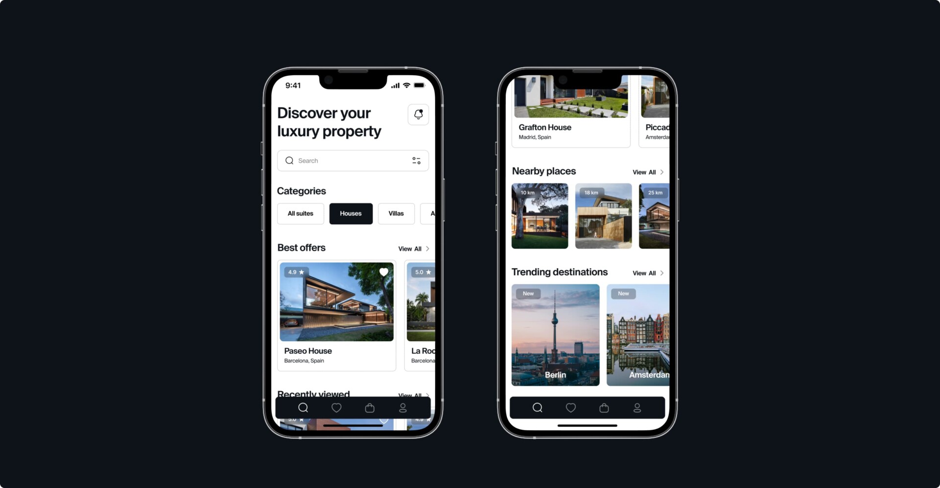
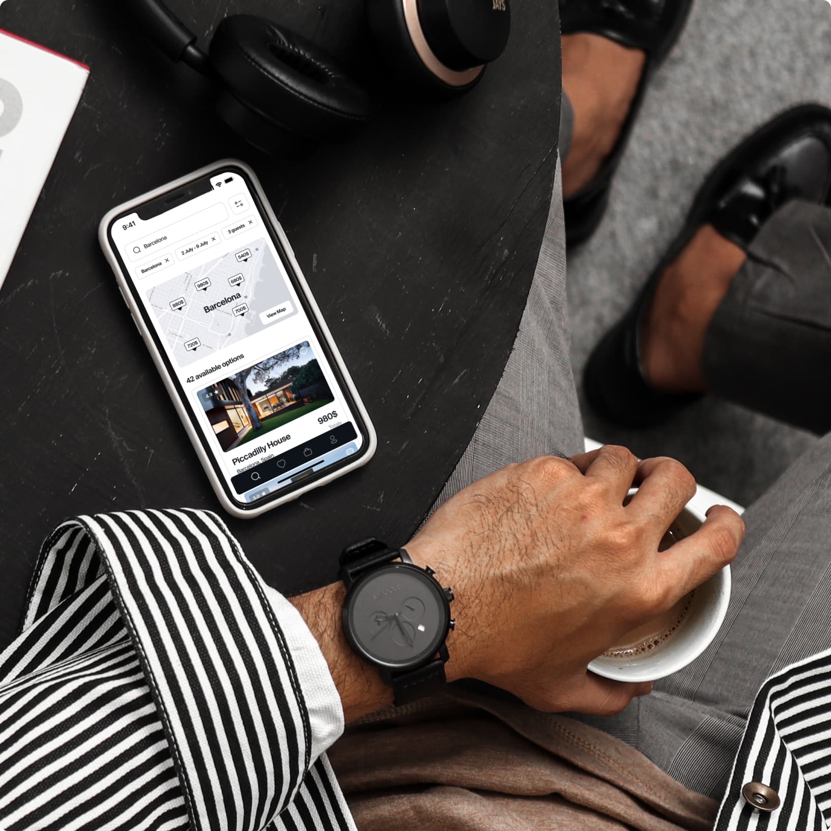
Homely was built to be the antidote. It’s a curated platform designed to feel less like a booking tool and more like a digital concierge for luxury travel. Fireart aimed to create the complete real estate app design from scratch, turning the vision for a seamless, professional booking experience into a reality.

Product
Homely
Industry
Proptech, Travel Tech
Services
Research, UX/UI Design, Product Design
homely-2
homely-1

Problem: A Premium Product Without a Premium Experience

Imagine you’re a busy founder or surgeon finally booking a rare vacation. Of course, you will splurge — and your biggest fear is getting it wrong. The problem Homely needed to solve was turning a stressful, uncertain search into a calm, confident, and swift booking.

We started with in-depth research, analyzing the market and reading user reviews on existing platforms. We quickly confirmed the main hurdles faced by discerning travelers.

Challenges

The Trust Deficit

High-end travelers have a key question: “Is this place really as good as it looks?” The real estate platform UX design had to eliminate that doubt and build trust from the very first screen.

The Paradox of Choice

On crowded platforms, users are overwhelmed by hundreds of “luxury” options, creating decision fatigue. Homely needed to feel curated and focused, not cluttered.

The Lack of Customization

Standard filter menus don’t work for this audience. A user doesn’t want to tick the box for any “pool”; they want a “private infinity pool.” The app needed to understand and cater to these nuanced preferences.
Goals

Our job was to design a platform that felt as calm and premium as the vacation itself.

  1. 1. Build a digital concierge. The main goal of the real estate app UI/UX services was to create a guided experience that anticipates user needs.
  2. 2. Make discovery a delight and turn the search process into an enjoyable activity with custom real estate software design that feels elegant, visual, and inspiring.
  3. 3. Design for “no surprises”. From the wireframes to the final UI, our goals were to provide clarity and ensure the reality would be even better than the pictures.
homely-3

Our Approach: The Gallery,
Not the Art

Our guiding philosophy was simple: the properties are the art, and the app is the gallery for a luxury traveler. Our entire approach to the real estate app design was to create an elegant, minimalist frame that would showcase the beautiful homes, not compete with them. 

01 A strategy of confidence

Deliverable: An empathy-driven design strategy focused on eliminating the “trust deficit” for high-end travelers and building a feeling of quiet confidence and control.

strategy-1
strategy -2

02 An elegant visual identity

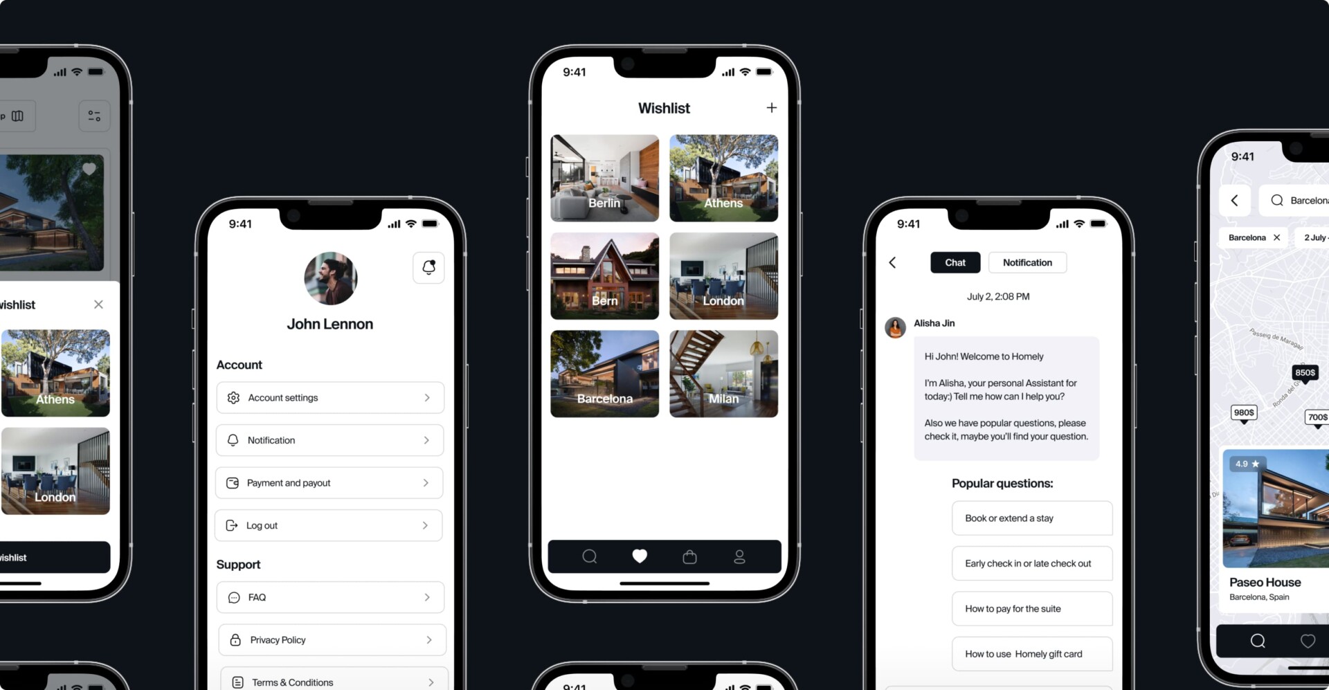
Deliverable: A sophisticated and professional visual identity that acts as an “elegant frame.” The UI was crafted with a clean, light color palette and considered typography to serve as a subconscious trust signal.

identity

03 A curated user journey

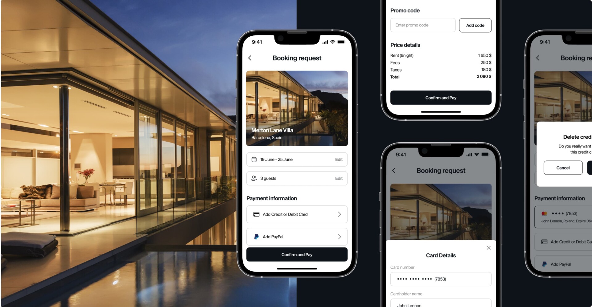
Deliverable: The strategy was to use the UI itself as the primary trust signal. The entire user journey flow was crafted to feel less like a booking tool and more like a personal concierge.

journey

The Architecture of a Premium Experience

Every design decision we made served one purpose: to create an elegant frame and showcase the incredible properties without distraction. Our process included every step from deep ux research to a pixel-perfect final product.

01 Building the Blueprint

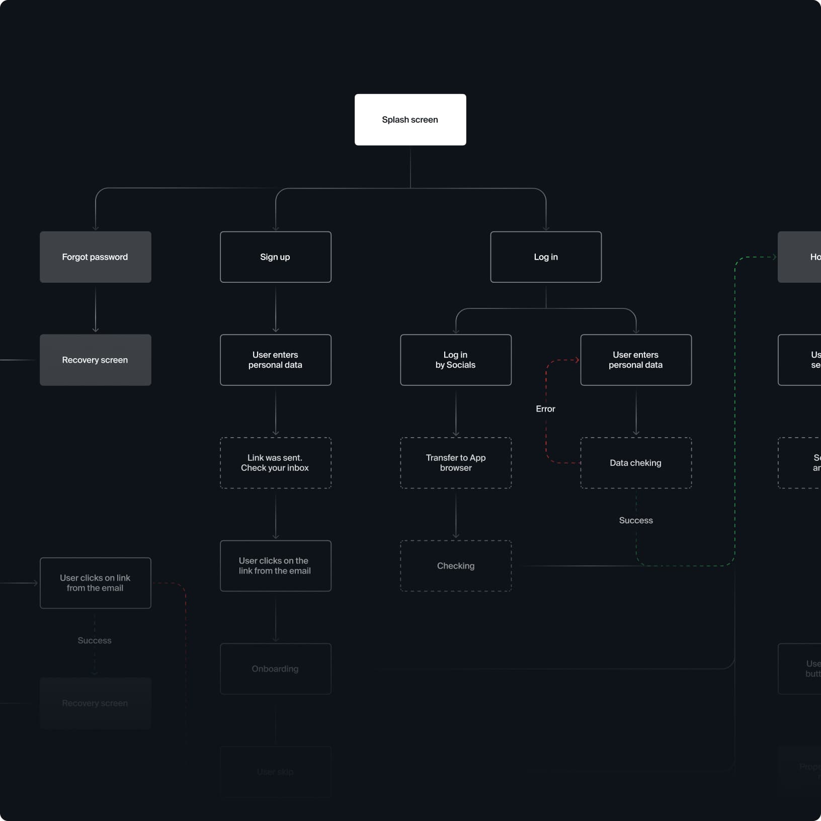
Before we could design the “gallery,” we had to understand the visitor. Our research started with an analysis of the luxury travel market and the specific pain points of sophisticated travelers. This led to a detailed user persona—a busy, successful individual who values time and trust above all. With this user in mind, we mapped the user flow and created wireframes.

Blueprint-1
Blueprint-2

02 Crafting the "Quiet" Interface

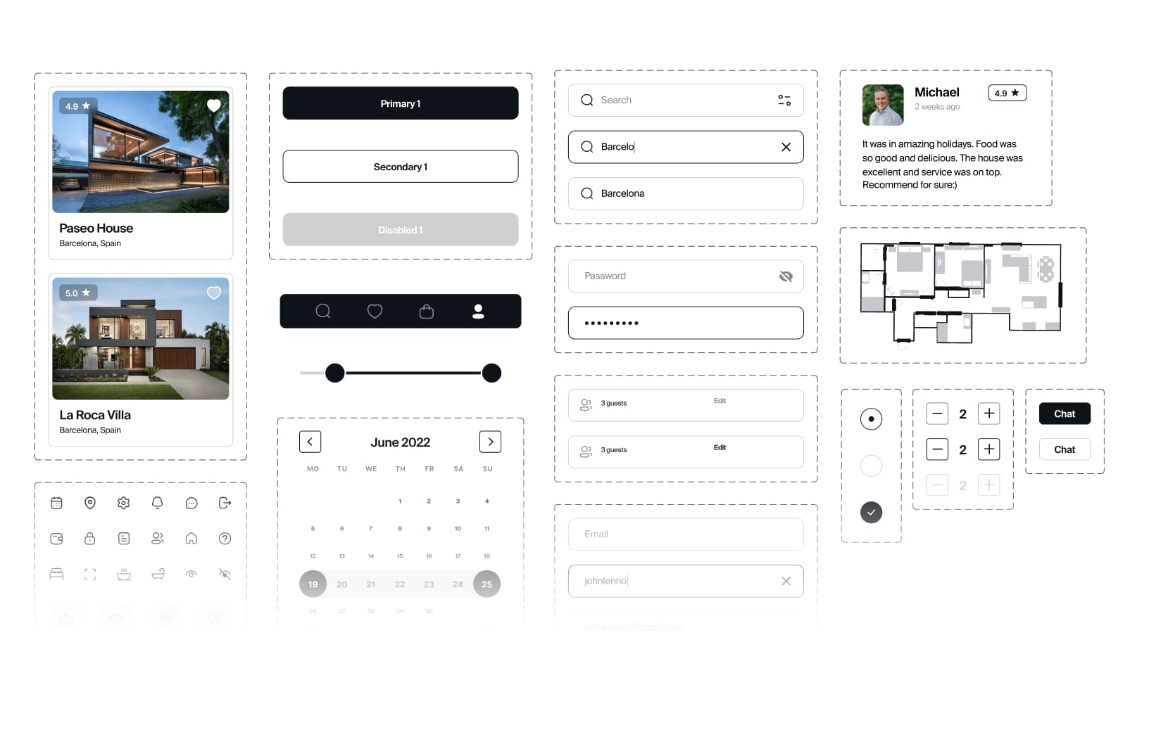
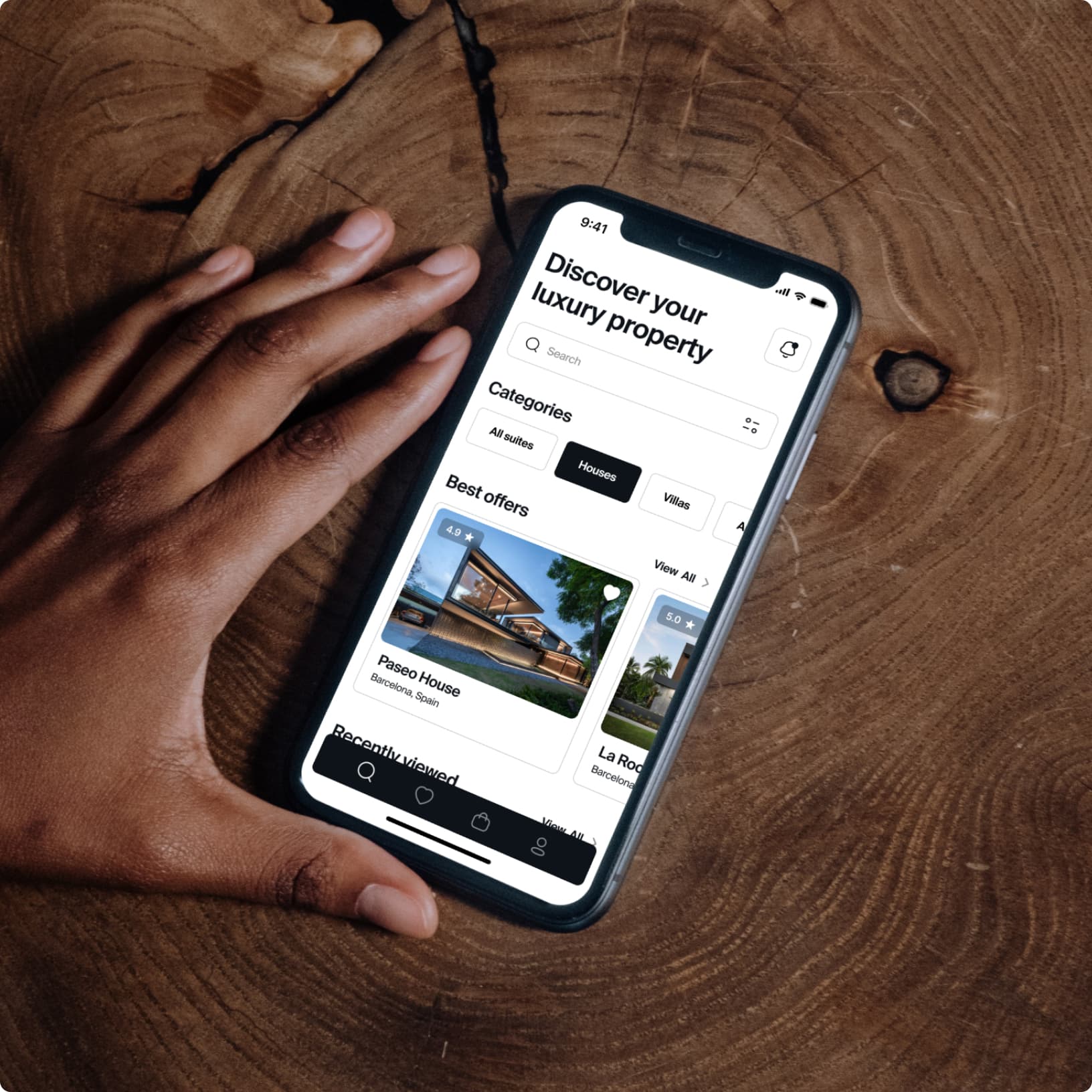
The visual design was an exercise in sophisticated simplicity. We created a clean, modern UI that gets out of the way and lets the property photos shine.

We used a strict, almost monochrome color palette with plenty of white space. The clean typography and clear visual hierarchy make information easy to digest, reinforcing the feeling of a calm, well-organized experience.

“The UI needed to be a quiet, elegant frame. We chose a clean, light interface with a minimalist aesthetic because it feels professional and lets the high-quality imagery of the properties really stand out.”

quote-img

03 Organizing for Clarity

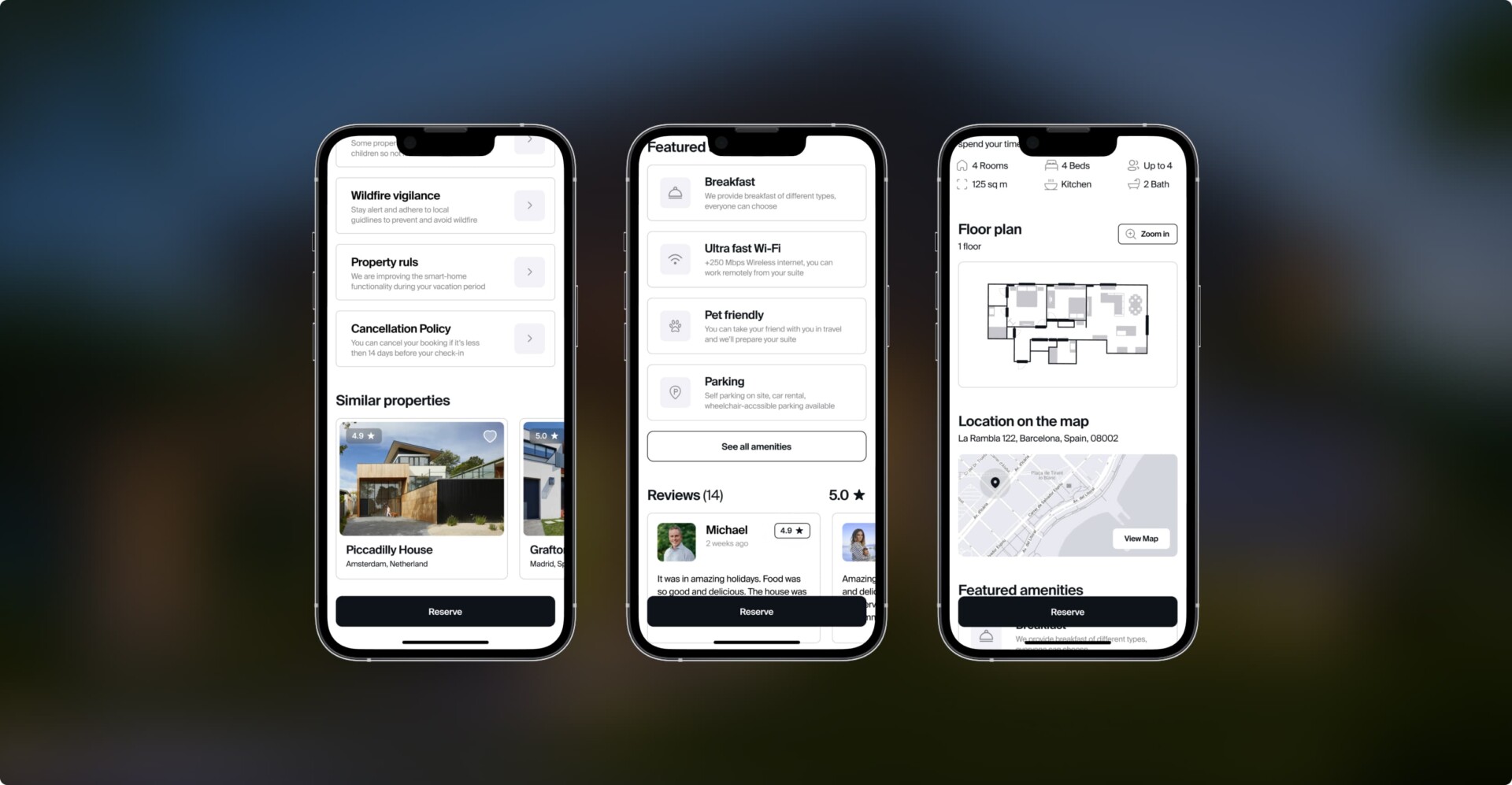
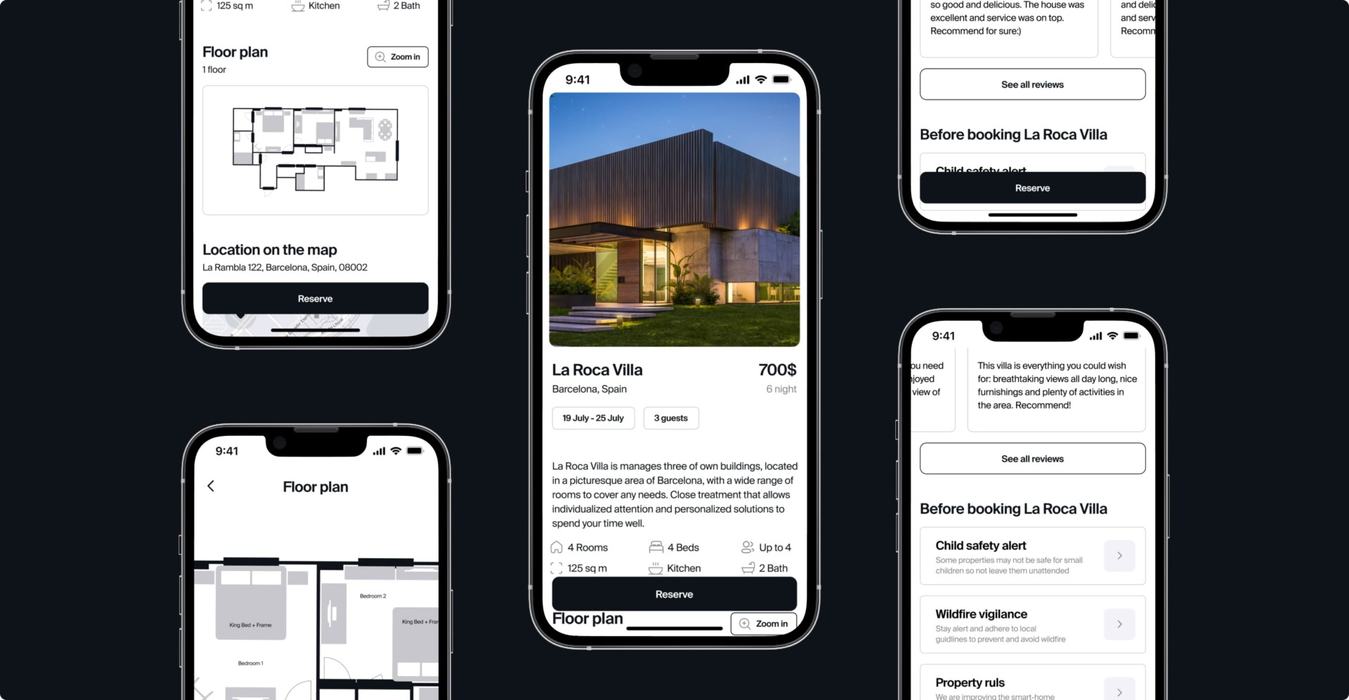
The biggest challenge in proptech app development is often the property details page. To avoid an overwhelming wall of information, we “chunked” the data into logical, scannable sections.

We used progressive disclosure — showing the top five amenities with a “See all” button, for example. This keeps the initial view clean, but allows the user who needs every detail to find it easily, giving them a sense of control.

Organizing

04 The Clever Detail

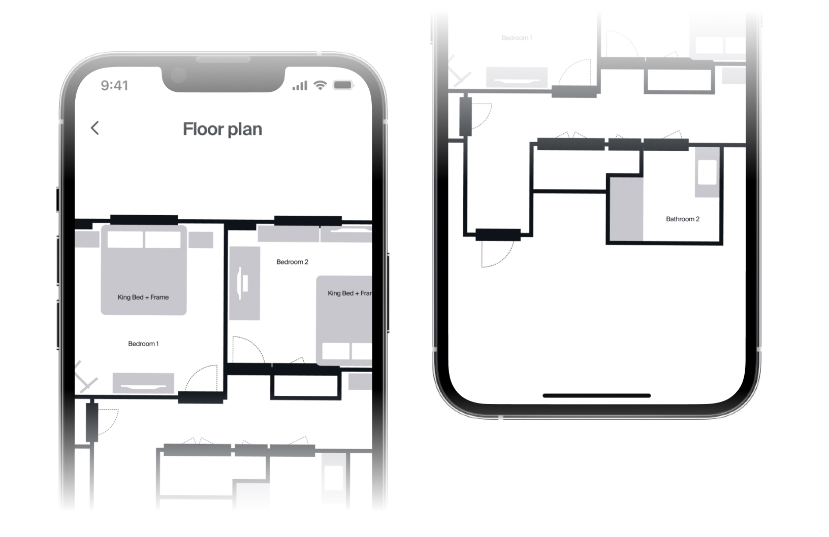
The most powerful feature of the property management app design is the interactive floor plan. A user can tap on a bedroom and see photos of that specific room.

“For a family or group traveling together, this feature is incredibly powerful. It answers so many unspoken questions, like ‘Which bedroom has the ensuite bathroom?’. It removes ambiguity and helps the user mentally place themselves in the space before they book.”

quote-2
Turns high-value decisions into a confident experience.

Results: A Showcase of Five-Star Experience

For a project like Homely, success is defined by two things: creating a complete solution to a real-world problem, and communicating our design philosophy. This real estate app design case study became a piece for our portfolio, proving our expertise in the luxury travel space.

A Complete Product Vision

A simple idea translated into a fully-realized real estate app design concept with deep user persona analysis, a complete user journey map, and a robust UI kit, demonstrating our ability to build a product from the ground up.

A Showcase of User-Centric Design

Designing for a niche, high-value audience and ruthless focus on the user’s need helped us create a concept for a custom real estate software design that is both beautiful and strategically sound.

Attracted New Clients in the Proptech 

The Homely real estate app design case study became a powerful magnet for new business. Its thoughtful ux review and professional execution directly led to Fireart winning multiple contracts with new clients in the proptech app development. It was the ultimate validation of our approach.

homely-quote
Ready for Life-Changing Design?
Let's see how our team can fast-track your business goals.