
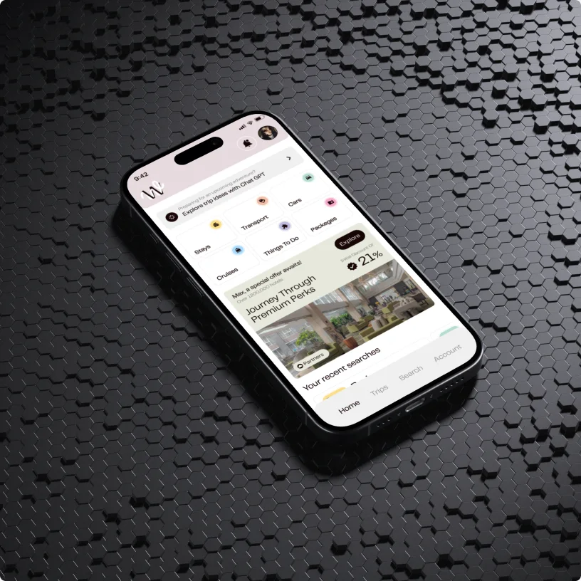

Analysis paralysis
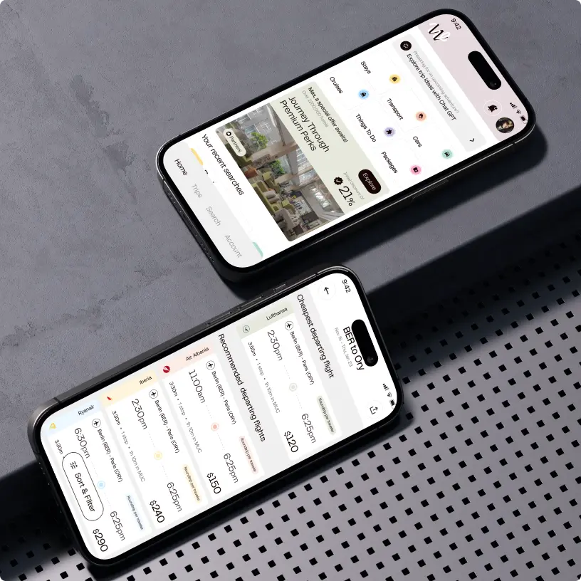
Travel apps are a data dumping hell – thousands of hotels, prices, destinations, options, and information. This overload causes users to freeze and drop off. We needed a travel platform UX design that acted as a filter without needing to set up filters.
The “Dream vs. Do” gap
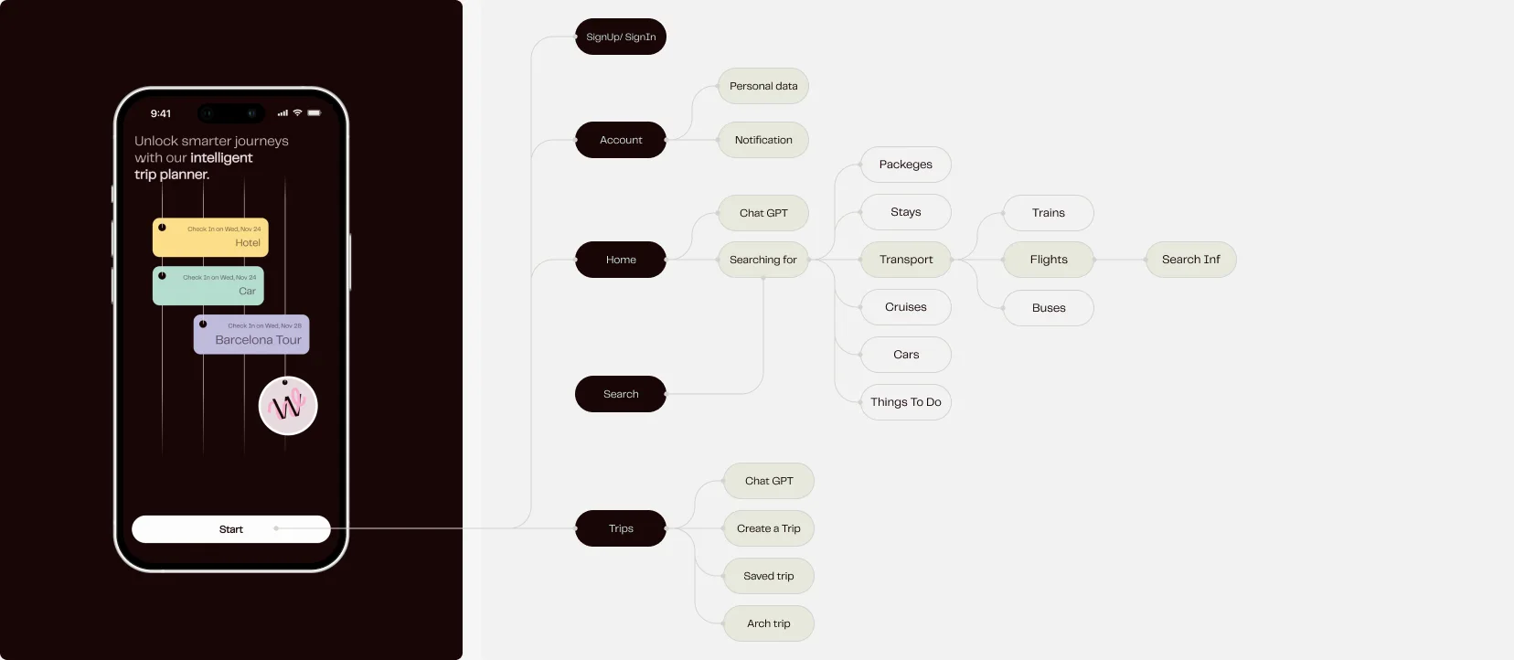
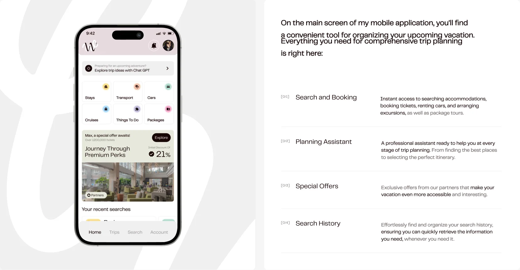
Discovery (think Instagram) and booking (think Expedia) happen in different worlds. Wayfaro wanted to close that gap, keeping the user in one flow from “dreaming” to “paying” without forcing them to switch apps.
The “Blank Canvas” fear
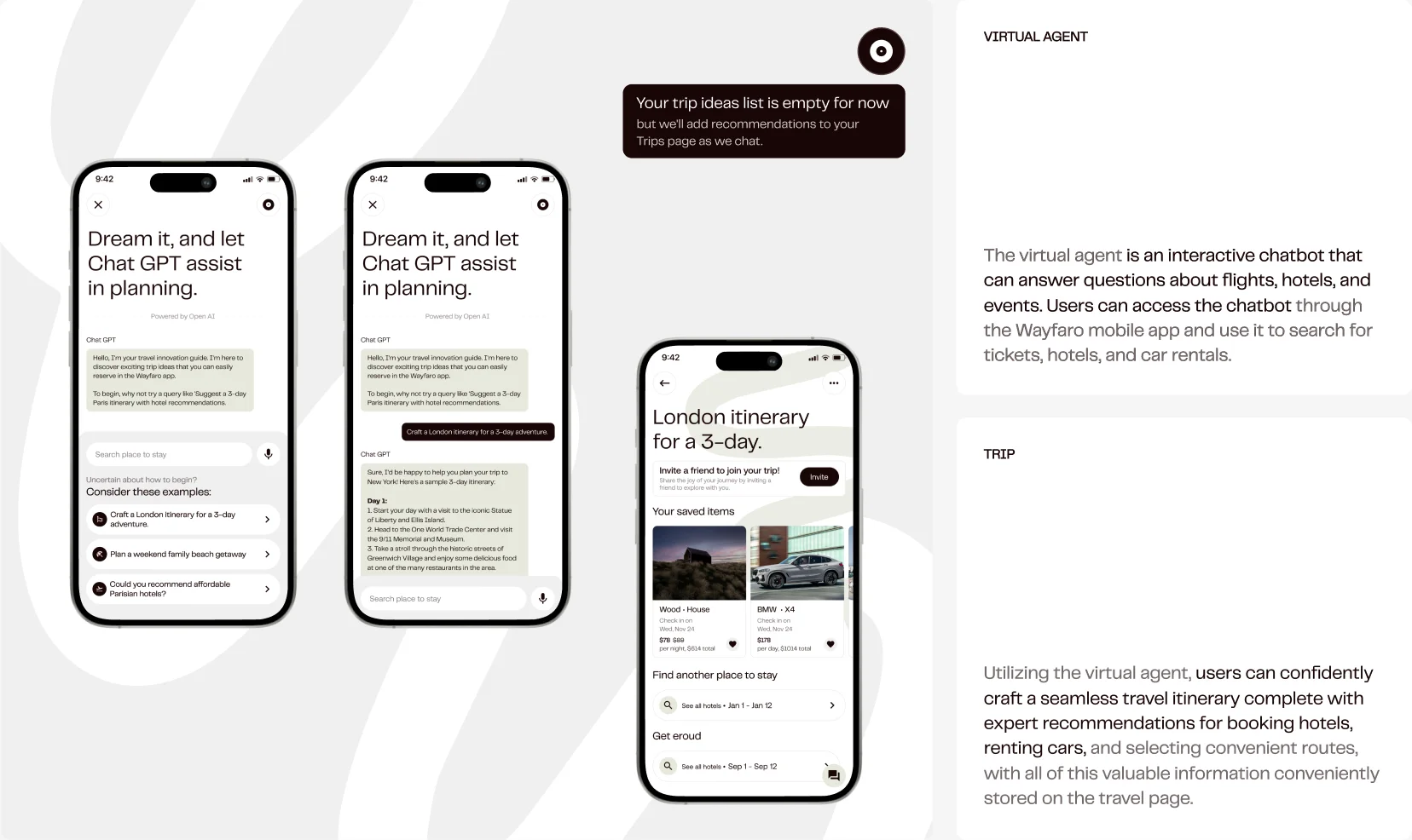
Starting an itinerary from scratch is intimidating. Users often know where they want to go but not what to do. We looked for a way to solve this without reading endless “30 things to do in XYZ” blogs.



















 Kotlin
 C++
 C#
 Ruby on Rails
 Java
 Firebase
 Python
 Vue.js
 HTML5
 CSS3
 Azure