
Logistics Management Platform UI/UX Design: Wireo Case Study

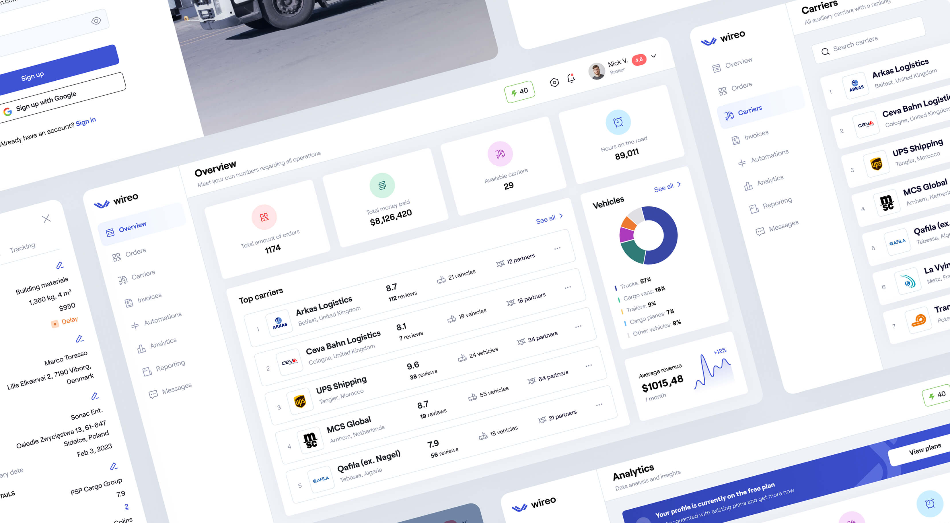
The logistics industry runs on anxious phone calls and manual data entry. We designed Wireo to quiet that noise. In this case study, we show how we created a logistics management software design that untangles the chaos of cargo delivery. By combining a discovery marketplace with a routing assistant, we delivered a role-based platform that gives brokers and drivers total clarity over their shipments.

Product Design
B2B
Logistic
SaaS
UX/UI Design
Logistics Management Platform UI/UX Design: Wireo Case Study

Wireo is a product blueprint designed to end the tracking blackout in large cargo delivery. In traditional logistics, once a broker assigns a load to a driver, visibility drops to near zero.

Wireo is a single source of truth connecting the office to the road. It acts as a marketplace to find cargo, a regulator to manage the deal, and a route assistant to track the delivery. We handled the logistics app UX UI case study, designing a unified system that simplifies operations for brokers, carriers, and drivers.

Product
Wireo
Industry
Logistics & Supply Chain
Region
Global
Services
Product Design, Branding, Design System
wireo-1
wireo-logo

Problem: The industry black hole

The logistics industry runs on a stressful mix of anxious phone calls and cramped spreadsheets. A broker secures a load, but once they hand it off to a driver, visibility disappears. Dispatchers spend their days making phone calls just to ask, “Where are you?”

Unplanned delays in logistics erode profit margins by double digits annually.
This gap between securing a deal and executing it was a human problem. We fixed the disconnect and quieted the noise.

Challenges

The fragmented workflow

Brokers had to use one tool for finding cargo and entirely different software for tracking it. We had to solve this disconnect by building a delivery marketplace app design that handles both steps.

The cluttered cockpit

Trying to serve brokers, carriers, and drivers on the same dashboard creates a messy interface. We needed a routing & logistics UX design with specific clarity for each distinct role.

The heavy legacy feel

Existing B2B logistics tools look like massive spreadsheets. They cause anxiety and slow down training for new staff. We aimed for an approachable cargo delivery platform UX that lowers workplace stress.
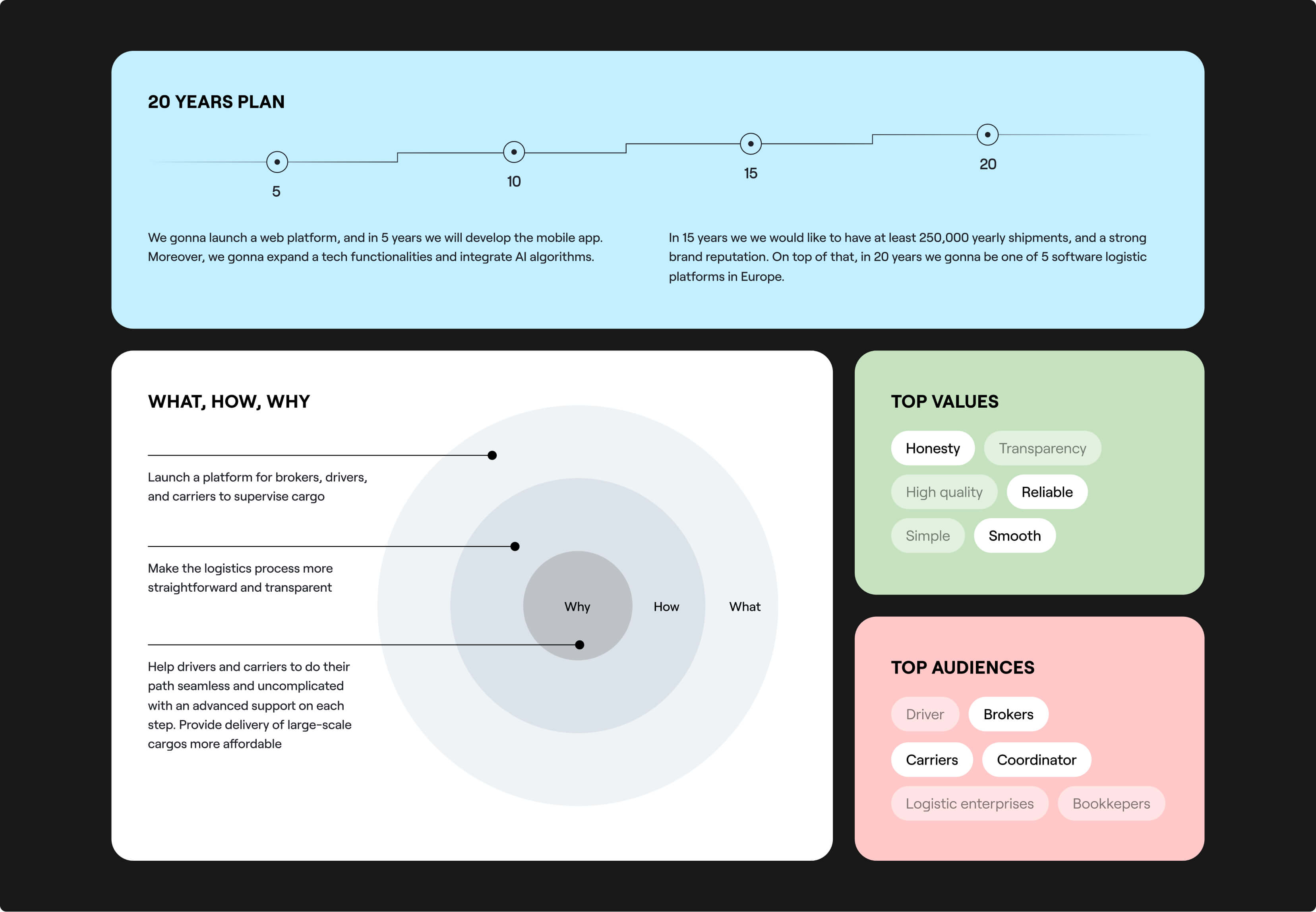
Goals

Our mission was to build a tool that replaces chaos with calm predictability.

Merge discovery and execution

Stop users from tab-switching. Build a platform where finding a load and tracking the truck happen in the same workspace.

Design for the busiest person

Create a logistic operations mobile UX that drivers actually want to use. If the driver app is easy, tracking data flows back to the office automatically.

Automate the repetitive tasks

Build smart tools to free dispatchers from making dozens of phone calls a day, giving them time back to secure new deals.

Our Approach

The concept was to eliminate the context-switching between software to find a load (a marketplace) and tools to track the truck (management). Our vision for this logistics management platform design case study was to fuse those two models into a single chain. We designed an environment where a broker can shift from picking a reliable carrier to the route execution, without ever changing tabs.
Every decision in our mobile logistics UI UX design was aimed at maintaining a consistent visual language, ensuring that as the user's task becomes more complex, the interface remains familiar and friendly.
wireo-approach

Building an unbroken chain
for cargo delivery

To merge a marketplace and an operational tool, we started with research workshops, mapping the daily realities of dispatchers and drivers to find where the handoffs were failing. This allowed us to build and test highly specific user flows through prototypes before finalizing the UI.
wireo-delivery

01 Merging two different mental models

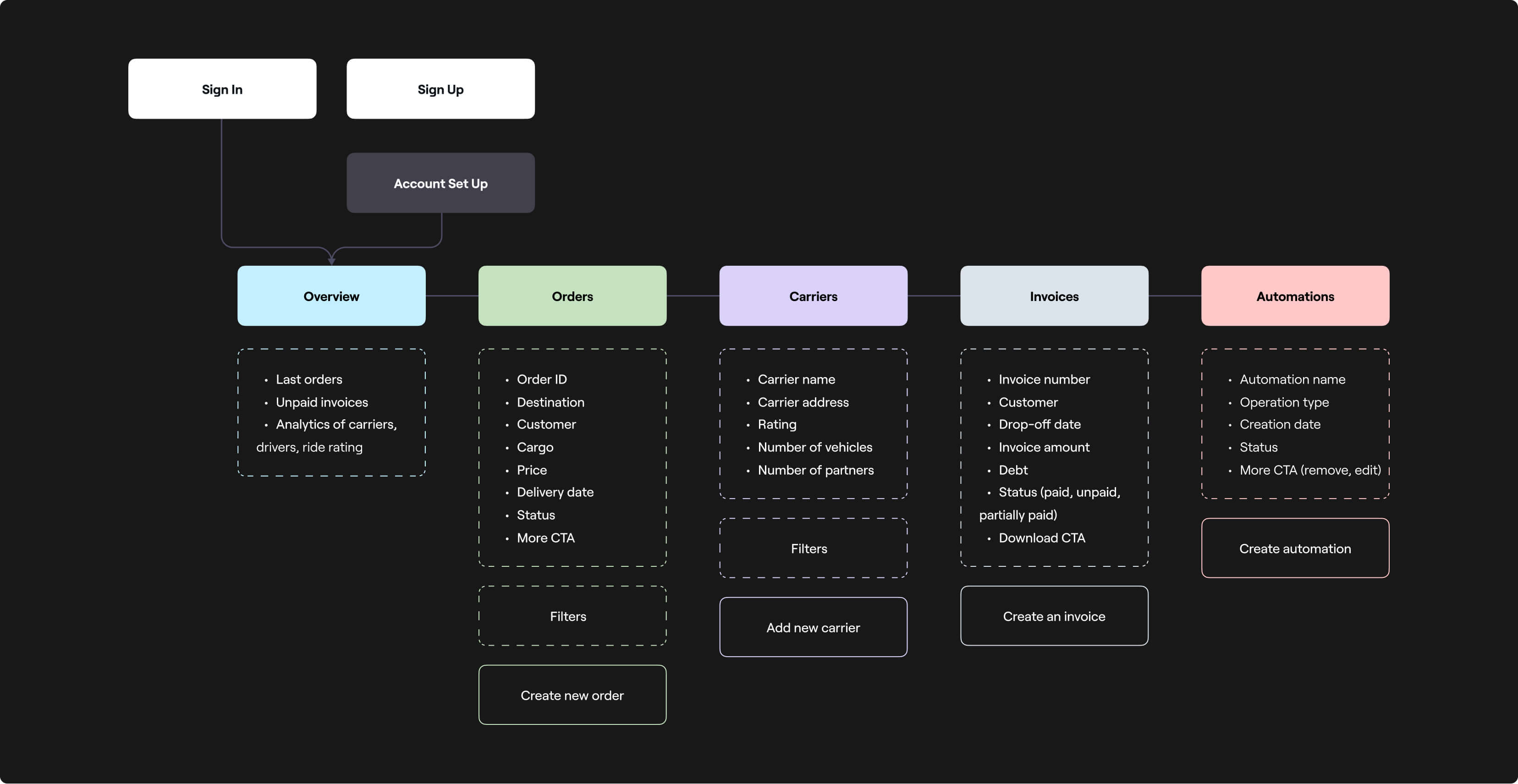
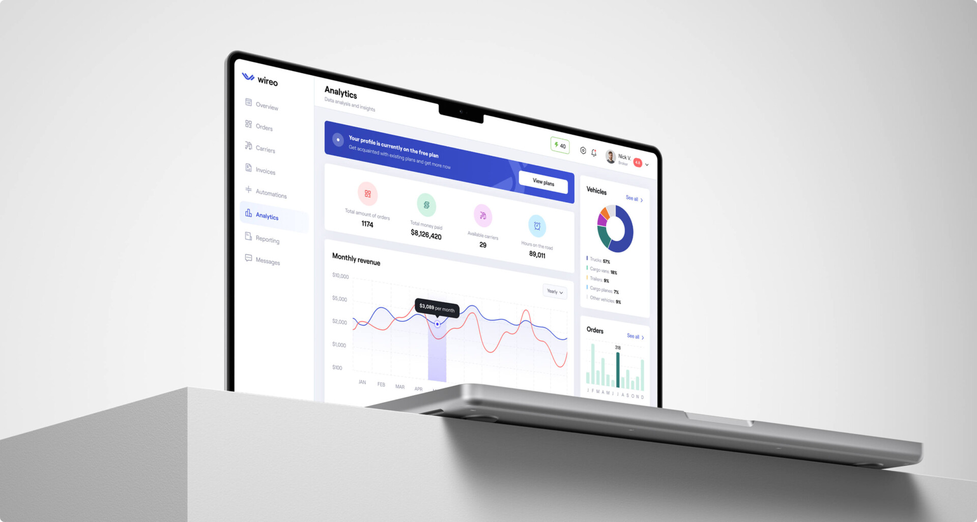
The hardest architectural challenge was merging the discovery phase with the execution phase. In a marketplace, users want to browse; in a management tool, they want speed and density. We designed a delivery marketplace app design where searching for a carrier naturally transitions into assigning cargo. We used persistent left-hand navigation to anchor the user, ensuring that as their mindset shifts, they never feel like they’ve jumped into a different piece of software.

wireo-architecture

02 Role-based clarity

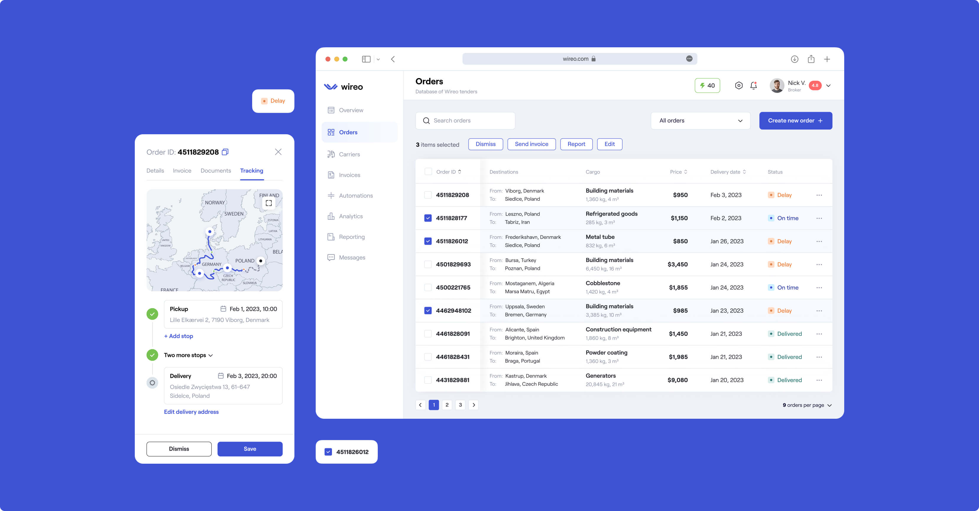
A tool built for everyone usually works for no one. We solved the clutter problem with strict role-based visibility. A broker logs in and sees a high-level cargo delivery platform UX with revenue charts and global maps. A driver logs in and sees only their specific route data. They share the same design system – the same buttons and typography – but the interface provides only what that specific user needs to do their job.

wireo-orders-screen

03 Creating a dedicated space for logic

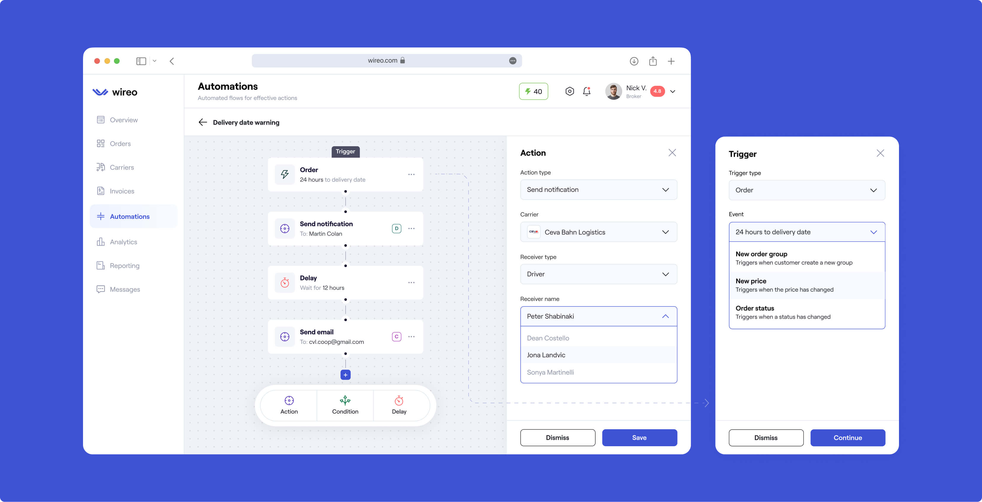
To protect the main dashboard, we designed a dedicated “Automations” module and turned complex programming logic into a visual, card-based puzzle (e.g., “When Delivery is Late -> Send Notification”). This allows non-technical users to build custom workflows.

Orders screen-1

04 Making communication context-aware

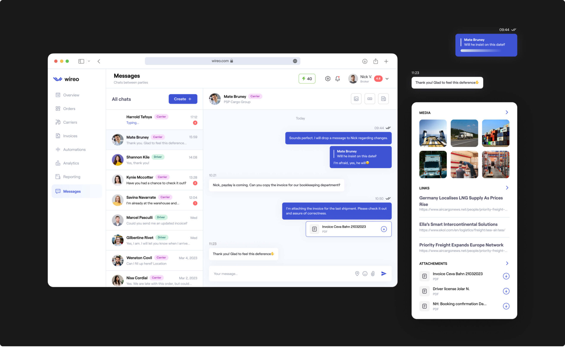
Using a separate chat app forces users to leave the context of the order, which slows down problem resolution. We integrated messaging directly into the routing & logistics UX design. If a driver reports a damaged shipment, the broker sees the message, the photo, and the exact order details on the same screen.

By tying the conversation to the transaction, we turned chat from a distraction into an integrated operational tool.

wireo-orders-screen-2
Want to end the tracking blackouts in your logistics operations?

Let’s talk your roadmap.

wireo-results

Results: A solution ready for the road

The primary outcome of this logistics management platform design case study is a fully realized, scalable product architecture. We turned the fragmented reality of the industry into a complete blueprint for daily operations.

Unified B2B platform

We turned discovery into execution. The resulting logistics management software design proves that a single platform can function as a marketplace, a route assistant, and an operational hub without overwhelming the user.

Scalable design system

We delivered a complete library of UI components. With this foundation, as the delivery marketplace app design grows and adds features, the development process will remain fast and the visual identity — perfectly consistent.

Role-specific clarity

Role-based data visibility solved the “cluttered cockpit” problem common in B2B software. The final logistic operations mobile UX provides tailored environments for brokers, carriers, and drivers, ensuring every user sees only what they need to succeed.

“Do not design for the CEO; design for the busiest person in the chain. If the mobile experience for the driver is annoying or slow, there will be no tracking data. If the tracking data is empty, the broker has no value, and the whole platform fails. Focus on reducing friction for the people doing the lifting.”

Ready for Life-Changing Design?
Let's see how our team can fast-track your business goals.